Liliana Electrical Appliances renews its identity to accompany its evolution
With a new logo, the brand updates its image to reflect the transformation of its products, the advancement of technology and new ways of living at home, without losing the closeness that characterizes it.


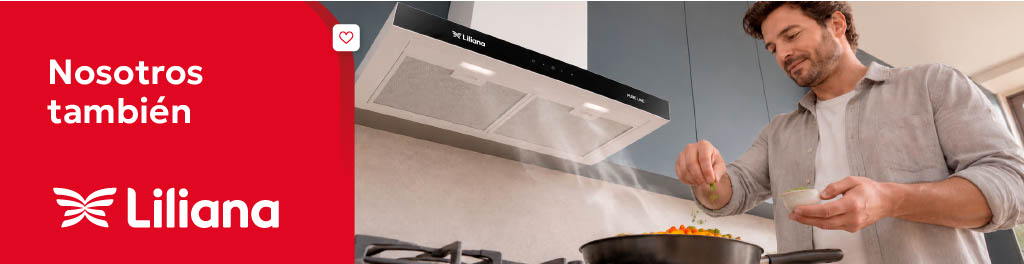
Liliana Electrical Appliances renews its identity to accompany the evolution of its product lines, and consolidate an increasingly modern, technological and design-focused proposal. As part of this process, the brand will present a new logo that reflects this growth.
Under the concept “Renewing (is) good for us” The idea that accompanies this rebranding is built, putting in the foreground a renewal that not only transforms the brand, but also those who choose it. Because renewing can mean many things: changing a habit, incorporating a new technology, transforming a space or simply finding a different way of doing everyday things. It is a personal experience that takes on a different meaning for each person, according to their own reality. This idea will be taken to different points of contact through a campaign with a presence in public, social networks, press, influencers, and digital channels.
The rebranding seeks to build a modern image, reflecting design and technology, without losing the closeness and organic tone that are key characteristics of Liliana. In this way, the brand maintains a solid relationship with the consumer and, at the same time, moves towards a more current proposal, while remaining accessible.
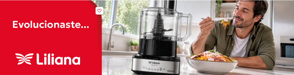
Since 1946, Liliana has accompanied people through changes in their homes and new ways of living in them. Along this journey, its products were also transformed to respond to new needs, incorporate technology, and add solutions that integrate into daily life. For this reason, the new isologo arrives as the crowning of this entire process that was done from the inside out, and will begin to be progressively incorporated into both your communication and your appliances.
The new isologo reinterprets Liliana's original symbol from a more contemporary perspective. Its open geometry evokes movement, transformation and the possibility of opening to new ways of living and accompanying. Inspired by the idea of spreading one's wings, it represents a brand that transforms and grows without losing its essence, open to change, new generations and new technologies. The new typography maintains Liliana's characteristic warmth, with a more modern, versatile and approachable imprint.
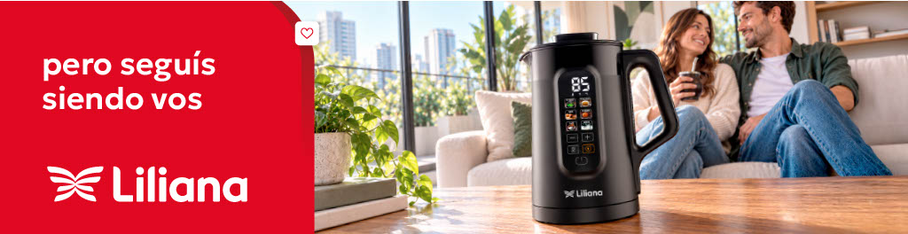
Evolution happens in three dimensions that meet and enhance each other. The brand, with a more current, modern and close identity; the products, which incorporate more design, technology and new solutions for the home; and the people, protagonists of new habits, needs and ways of living at home. These three universes constitute Liliana's comprehensive proposal and are expressed throughout the year in different categories - ventilation, heating and small appliances -, always present in real, everyday situations.
Thus, Liliana transforms her identity to accompany a story that she has been building for 80 years, maintaining what made her close and choosing new ways of being present in everyday life. Because evolving is growing without losing the essence.



Latest news

E-commerce in Argentina: Electronics leads online sales and Grocery is the category that gains the most participation in 2026

Outstanding sector